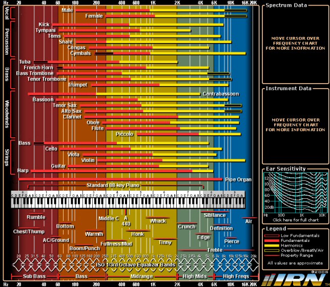
Pictured below is what looks to me like a very handy chart of the frequency range of orchestral instruments. This is intentionally small because you should click the image to be taken to the interactive version of the chart.
During the mixing phase, it’s common practice to use high pass and low pass filters to remove unneeded frequency ranges from each instrument (see my blog post “Video – High Pass Filter“). For example, a flute doesn’t need to be contributing low frequencies in the bass range, so use a high pass filter to remove any low flute frequencies that are effectively noise and only serve to interfere with the sound of the bass. The opposite is also true, the bass doesn’t need to be contributing high frequencies near the top end of the flute range, so use a low pass filter on the bass. Doing this for every instrument should result in a cleaner sound because all these little things add up.
As always, use your ears when adjusting a filter, but the above chart provides a handy guide for where to place the threshold of a low or high pass filter for each instrument and also where each instrument sounds strongest.
For an example of someone explaining this chart and putting it into practice see the video below:

i’m sure this is a good one =)
How can I buy this chart printed on A2 seize?
I guess you’d have to track down the owner of the chart and see if they sell it. I’m not the owner, I’m just linking to a site that hosts the interactive version of the chart.
I am DYING because your interactive version is down.
Can I rehost it?
PLEASE
The interactive version isn’t mine. It’s hosted on a different web site which seems to have been suspended. There is nothing I can do about it. I don’t have my own copy of the interactive version.
EDIT (Aug 26, 2020): Just found a new source for the interactive frequency chart. It should work now.